My illustration process WILDHOOD A Children’s Art Festival

In deepest Perthshire, amidst endless hills, dense forests, and lush vegetation, lies Wildhood. An arts Festival specifically designed for children and their families.
….and boy, oh boy, jings crivens and jiminy crickets! I am looking forward to it, greatly.
Global Pandemics aside, being a parent and finding a Festival that ticks the boxes for both you and your little people is a tall order, but I am delighted that Wildhood exists and that I’ve been able to play a small part in it with my illustrations, since its inception and launch way back in 2018.
…and I’m very happy to say that the fabulous Mel (Wildhood head honcho) asked me to create the promotional artwork for the upcoming 2021 Festival. I created the artwork just a month ago in November this year, amidst the gloom of a classic soggy, Scottish winter. Fuelled by cups of tea and biscuits, the illustration proved to be a real treat to work on, using some new materials and processes (that I will touch on below) and presented a burst of colour, in a time that for me had become an increasingly challenging period in maintaining creativity. It was a great tonic for the time and headspace I was swimming in (more like doggy paddling), so thank you Wildhood, for allowing me to shake it all off and sharpen my pencils once again!
….and so, I thought I would share some of the process that went into this years illustration, all the way from sketchbook to jungle mess making, back in November in my studio.

Step 1 in the process is a combination of research and where you’d probably expect an illustrator to begin, the sketchbook… it’s about to get scribbly.
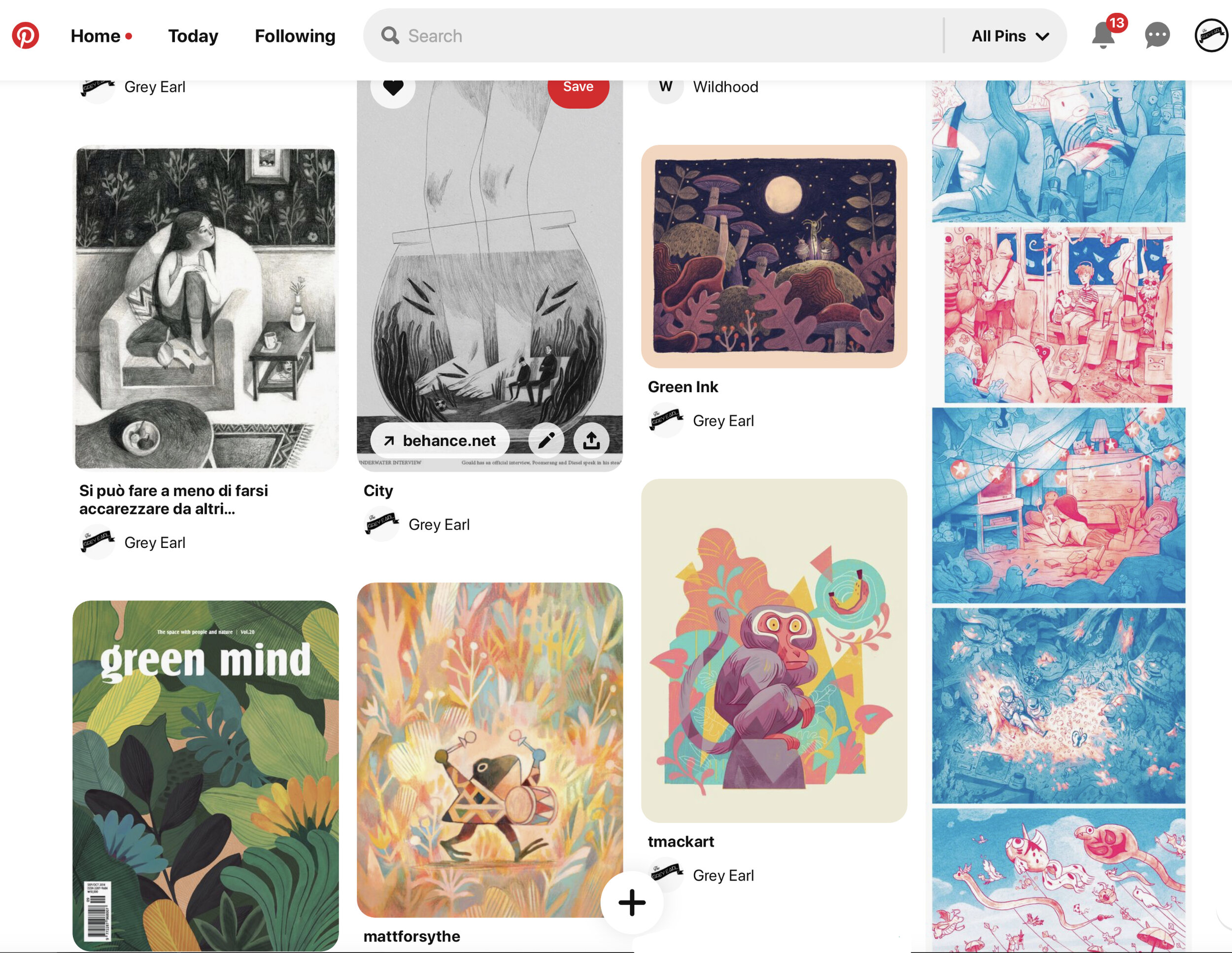
I usually start projects like this by creating boards over on Pinterest and pulling together lots of different images of the particular characters (or in this case animals) that I like the look of. They might be in different positions, sitting, standing, or in motion and I also like to compile illustrations by other artists that have a colour palette or structure that I’m interested in exploring (see below).
Then it’s onto the sketchbooks where I will draw very loosely, just trying to capture some character in each of the animals. I often find that the looser, quicker drawings provide the best foundations for what I want to try and carry over into the final artwork. That is always the biggest challenge I find, trying to keep that sense of energetic drawing in the initial mark making and incorporate it into a more fully rendered illustration. It’s very difficult and something I am continually trying to improve on.
I also use my sketchbooks to record important notes, like, should they be wearing paper party hats or wooly ones… a question for the ages!

Initially, I loved the idea of a really wide panoramic visual, as mapped out roughly in the sketch below. As you can see, I like to keep the drawing really rough and loose at this stage, using simple shapes to take the form of the characters and get an idea for how all the image flows. I tend to repeat this kind of layout many times, until the shape and spacing of the illustration feels balanced. I’ve also found myself favouring orange and reddish brown pencil crayons for sketch and line work. I’m not entirely sure why, but my small pencil case which I take out when just doing sketches is always brimming with the orange stuff.

Admittedly, a panoramic illustration is not the most practical layout for things like posters, but it can lend itself nicely to social media banners or website layouts. It also gave me an idea for a concertina style book which I’m hoping to revisit in 2021 and maybe bring along to the Festival as a limited print run…. watch this space.
Step 2 is finalising the sketch for proof. Once the characters have been realised in the sketchbook, I plot out a larger drawing with a background.
This is usually done in my sketchbook first, more recently I have finished this layout work in Procreate on my iPad. It’s a brilliant drawing programme that allows me to change elements quickly. For this project I was interested in trying out a limited colour palette, and making the background quite expressive. So I printed out a sketch I had made in Procreate in black and white and then worked on top of it really loosely with chunky wax crayons and water based markers. This allowed me to quickly render the foliage of the jungle and see how well the loose approach and minimal colour palette was working. Some of the quickly drawn plant life made the final cut, quite often the backgrounds of my illustrations benefit from this fast approach, helping to balance the more intricate work, with a bit of good old fashioned energetic drawing!


Once the sketch has been approved with my lovely client, it’s time to move onto rendering the final artwork.
Although I quite liked the pinks and purples of the initial sketch, we decided (wisely) a wider range of colours would better suit the Festival, to really bring the life of the Jungle to the front. I’m glad we went down the more colourful route as it gave me the opportunity to try out some new materials which I’m hoping to make a regular in my work moving forwards.
In order to give the image more vibrancy, I used Gouache acrylic paints to lay down the initial layers of colour. It was my first time using this type of paint and was an interesting experience. I approached it similarly to the way I paint with watercolours, but it allowed for a more vibrant finish.
I also used my regular drawing tools of choice, including Caran D’ache neocolour water soluble wax pastels (I LOVE these!) and Faber Castell Polychromos pencil crayons, an absolute mainstay…. for all those pencil geeks out there.


You can check out a time lapse of some of the elements of the process below. It was probably the first time I had worked so loosely on a background. I enjoyed the balance of the two styles, having those slightly haphazard marks and textures that form from water loaded paper and free running watercolour, to the kind of drawing I am more used to, working very tightly with pencils…. Unfortunately, I couldn’t record all of the process, because my giant head got in the way… but fear not, I shall make sure my camera/giant head is better placed in the future.
…and here she blows, the Wildhood Children’s Art Festival 2021 illustration complete, featuring a right old musical bunch of jungle dwellers.


….sounds good right? Treat yourself and go checkout Wildhood Festival today. Me and my girls are on countdown for June 2021, it’s going to be a wild old time and I’m looking forward to seeing how these animals feature on site, in the beautiful grounds of Tullibole Castle very soon….
Maybe see you there?